H-E-B Pill Reminder — My H-E-B Native App, Summer 2023
Designing a native medication reminder feature for the My H-E-B app. Bringing back a beloved legacy tool with a new and improved experience for pharmacy customers.
H-E-B's legacy pharmacy app had a pill reminder feature that customers depended on to manage their daily medications. When the platform migrated to the My H-E-B native app, the feature was deprioritized and left out — and users noticed immediately.
My internship project was to design a new and improved pill reminder experience for the My H-E-B app, helping customers stay on top of their medication intake while supporting business goals around medication adherence.
The Cx (customer experience) Pharmacy squad at H-E-B is responsible for designing and improving the digital pharmacy experience for customers and partners — across both Heb.com and the My H-E-B native app.
Their goal is to make getting and managing prescriptions a convenient and streamlined process — allowing customers to get their prescriptions how they want, when they want. The squad launched with base app features in 2022 and has been iterating and enriching the experience ever since.
App reviews and user feedback made it clear: customers had built real habits around the legacy pill reminder feature. When it disappeared, they noticed — and they weren't quiet about it.
Prior users want pill reminder back — and without it, customers forget to take medication on time, consume the wrong medication, and struggle to track and commit to their intake habits.
The feature had to serve two audiences — customers who needed a simple, trustworthy reminder tool, and the business, which stood to benefit from improved medication adherence. One technical constraint shaped the entire approach.
The current My H-E-B Pharmacy app does not have push notification capabilities — this project was designed for a future state of My H-E-B, and the feature was scoped accordingly.
I began by auditing the legacy pill reminder screens and conducting a competitive comparison analysis — understanding what existed before and how comparable apps handled similar reminder and medication management flows.

The original pill reminder screens from the legacy pharmacy app — the baseline we improved upon.

Auditing how competitors handle reminder flows, data visualization, and medication management to identify patterns and opportunities.
To ground the design in real user needs, I developed a user persona representing the core target audience — customers who rely on the pharmacy app to manage ongoing prescriptions — and mapped their journey through the current experience.
The journey map revealed key moments of anxiety and friction: the moment a customer realizes they forgot their medication, the confusion around which pill to take, and the absence of any feedback loop to reinforce adherence habits.
How might we make medication management simple, trustworthy, and habit-forming for H-E-B pharmacy customers?
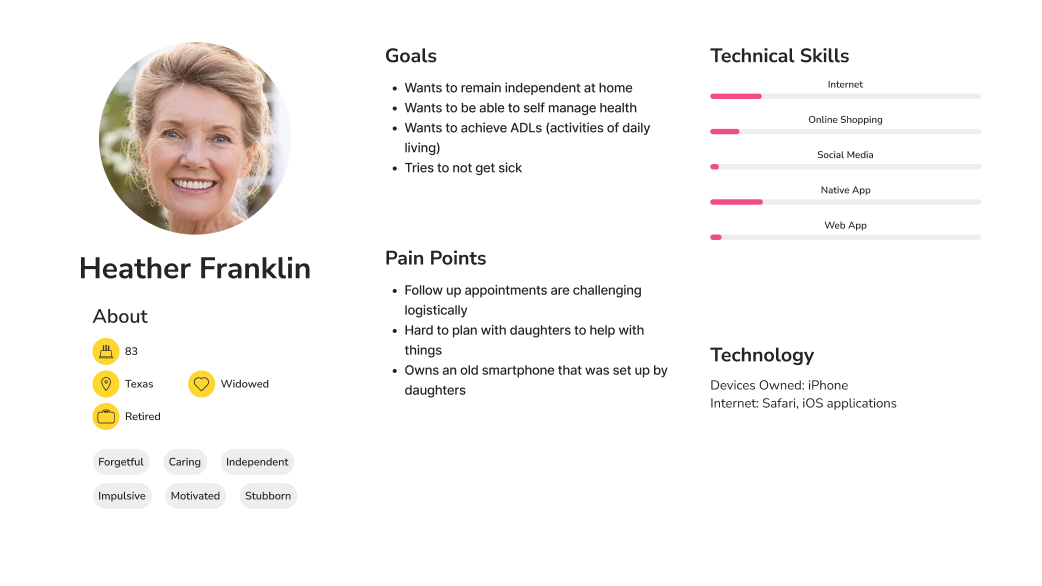
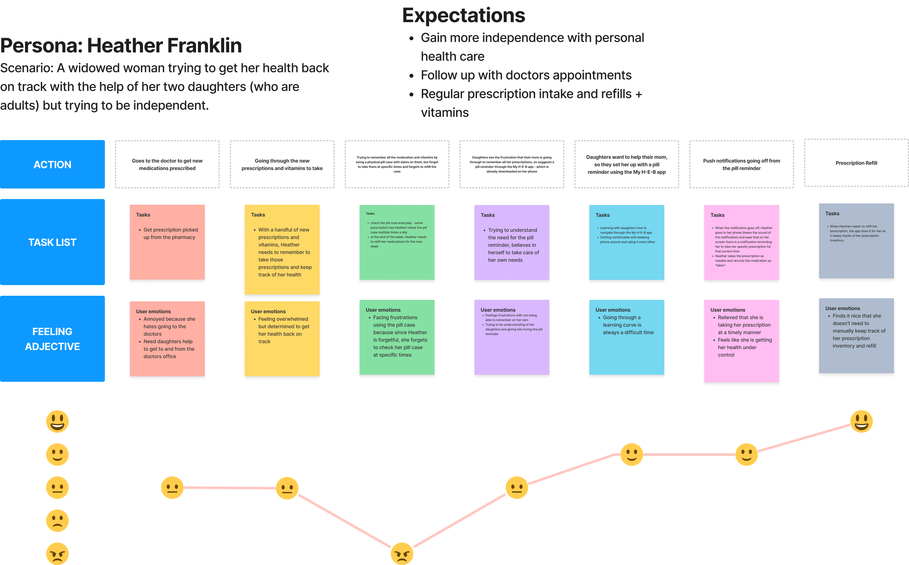
User persona and journey map — identifying pain points, emotional highs and lows, and opportunities across the current experience.
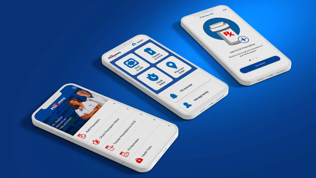
Before moving into wireframes, I defined where the pill reminder feature would live within the app's existing structure — and what entry points users would have to access and manage their reminders.
Information architecture — defining the feature's location and entry points within the My H-E-B app.
The design process moved from low-fidelity wireframes through iterative refinement, always referencing the design principles and user journey to validate decisions before progressing.
Lo-fi wireframe explorations across the setup, reminder, and tracking flows.
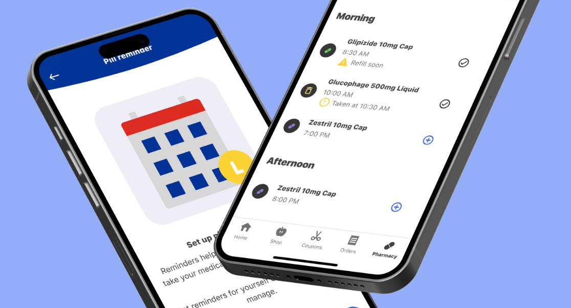
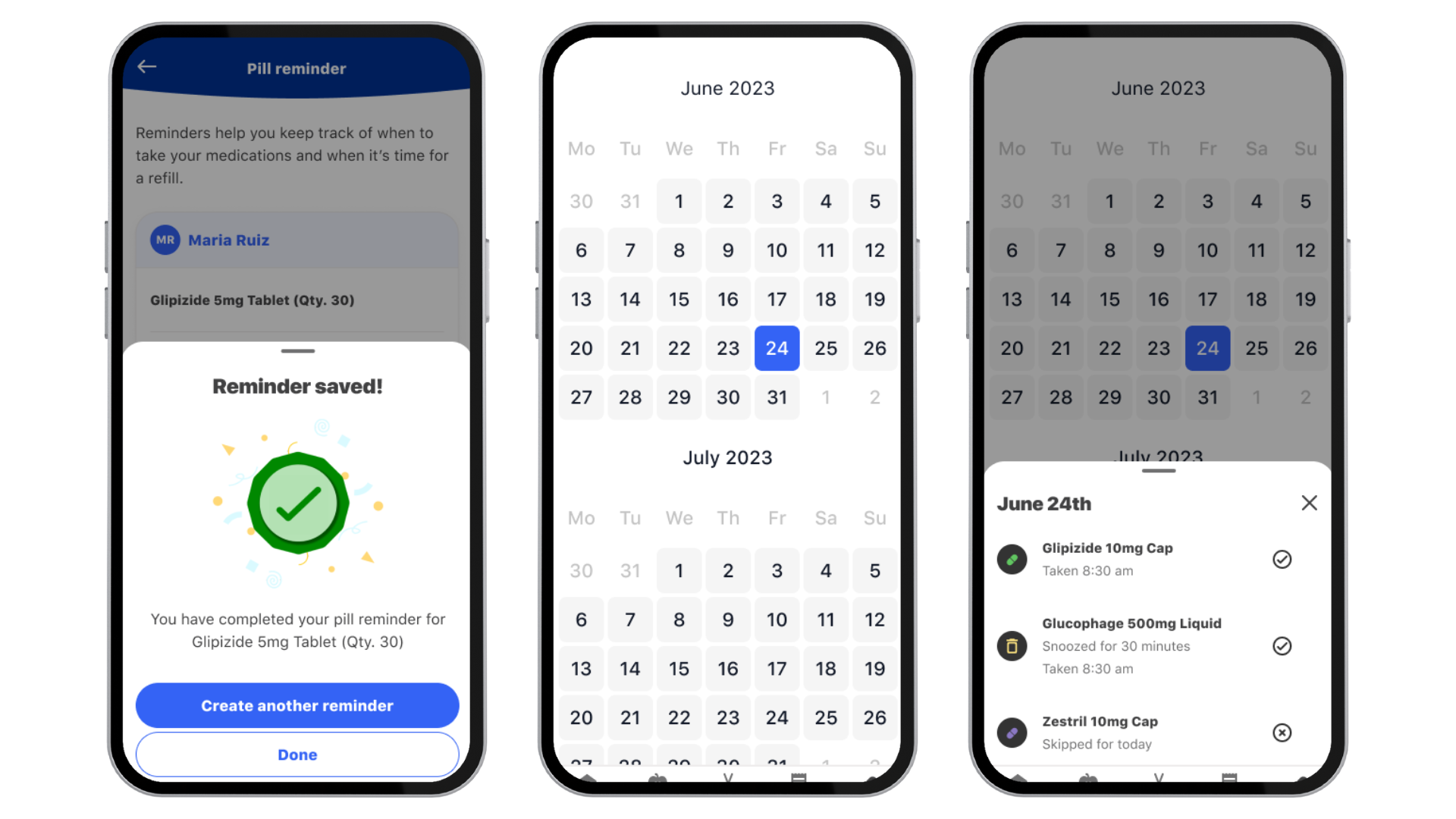
The final hi-fidelity designs addressed the full pill reminder experience — from first-time setup through daily reminders and adherence tracking — all within the My H-E-B app's native design language.
Final screens — reminder setup, daily widget, and adherence tracking.
The pill reminder designs were delivered as a Minimal Viable Product (MVP) — validated through user testing and research, with clear next steps defined for future iteration and expansion.
The project opened up a broader conversation within the team about out-of-scope explorations, web parity, and deeper collaboration between design and engineering.
Working on H-E-B's pill reminder taught me that design in the healthcare space carries a different kind of responsibility. When someone depends on your feature to take their medication correctly, every interaction — from onboarding to daily notification — needs to feel clear, calm, and completely reliable.
I left this project with a sharper sense of how to balance user goals with business constraints, and a deep appreciation for designing within an existing system rather than from scratch.