At Gazelle Ecosolutions, I redesigned the desktop dashboard and onboarding experience for an environmental data platform used by carbon credit verifiers — translating complex satellite science into an interface that actually makes sense — to support real conservation work protecting the Kalahari and Okavango ecosystems.
"Translating complex environmental data into user-friendly interfaces that contribute to a more intuitive user experience."
Gazelle Ecosolutions is an applied science lab protecting Africa's rangelands — specifically the Kalahari and Okavango regions of Botswana — by building technologies at the intersection of remote sensing and ecology that power carbon and biodiversity credit projects. Their flagship product, the Gazelle Data Hub, enables their science team to run satellite-based land analysis algorithms — Landtrendr, CCDC, and SMA — to generate MRV (Measurement, Reporting, and Verification) reports that verify carbon sequestration for registry-grade carbon credits. Their first project, MODISA in Botswana's Kgalagadi region, was the first nature-based carbon project in the entire Kalahari — verified through the International Carbon Registry.
The problem: the platform was technically powerful but hard to use. Scientists were spending more time wrestling with the interface than doing science. With real conservation land — 17,000 hectares of Kalahari — on the line, the quality and speed of analysis runs directly affected the viability of carbon credit projects that fund Gazelle's entire conservation mission. Onboarding was a multi-session ordeal. And the codebase was growing without a shared component system, slowing down the engineering team.
I was brought in to design across two distinct products serving very different user types: the internal Gazelle Data Hub for Gazelle's own scientists, and a landowner self-service tool that let ranch owners register their land and receive carrying capacity recommendations — without needing a scientist to guide them.
Two user groups with completely different needs. Scientists needed a powerful spatial analysis platform. Ranch owners needed a guided tool that translated complex science into plain decisions. Both products lacked the clarity, structure, and shared design language to serve their users well.
Working within an agile team, I followed a research-first approach — understanding the mental models of scientists before touching any pixels.
Audited the existing platform against Nielsen's 10 heuristics, identifying friction points across the onboarding flow and data analysis tools.
Conducted interviews with internal scientists and client teams to map their workflows, mental models, and pain points when running satellite analyses.
Created 40+ wireframes covering the full redesign — from the onboarding splash screen through each analysis tool to report generation.
Built a component library in Figma aligned with the engineering team's patterns, reducing design-to-development friction by 35%.
Through user interviews and workflow mapping, three core insights shaped every design decision that followed.
Scientists needed to understand what a tool does before being asked to configure it. The old flow dropped users directly into dense parameter inputs with no orientation. A welcome/intro screen with plain-language descriptions reduced confusion significantly.
Analysis runs take time. Without clear progress states — what's running, what's done, what's pending — users repeatedly re-triggered processes they thought had failed. Explicit task checklists and loading modals addressed this directly.
Ranch owners had no scientific background but were expected to input spectral parameters and emissions data. Replacing open-ended forms with option cards, confirmation screens, and plain-language labels removed the expertise barrier entirely.
Every analysis is tied to a geographic region. Users thought spatially first — they needed to see the map to orient themselves before making decisions. The three-panel layout (parameters → map → time series) matched how scientists naturally work.
The work covered two distinct tools — an internal science platform for Gazelle's team, and a self-service ranch onboarding product for landowner clients. Each required a completely different design approach.
Used by Gazelle's internal team to run Landtrendr, CCDC, and SMA algorithms on satellite imagery — generating the MRV reports that underpin carbon credit verification for real projects like MODISA in the Kalahari.
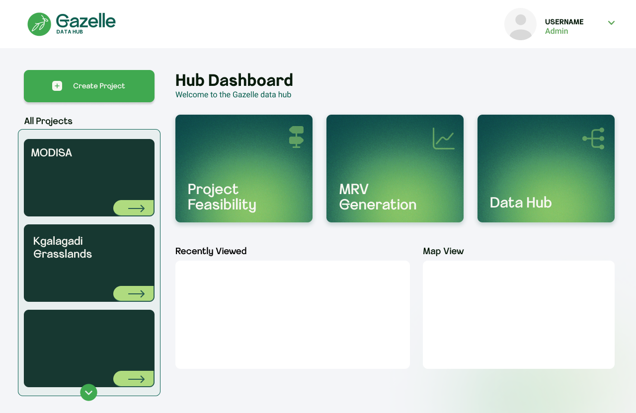
Three core workflows surfaced as prominent tiles (Project Feasibility, MRV Generation, Data Hub) alongside a project sidebar showing real projects — MODISA and Kgalagadi Grasslands. Navigation reduced from 4+ clicks to 2.
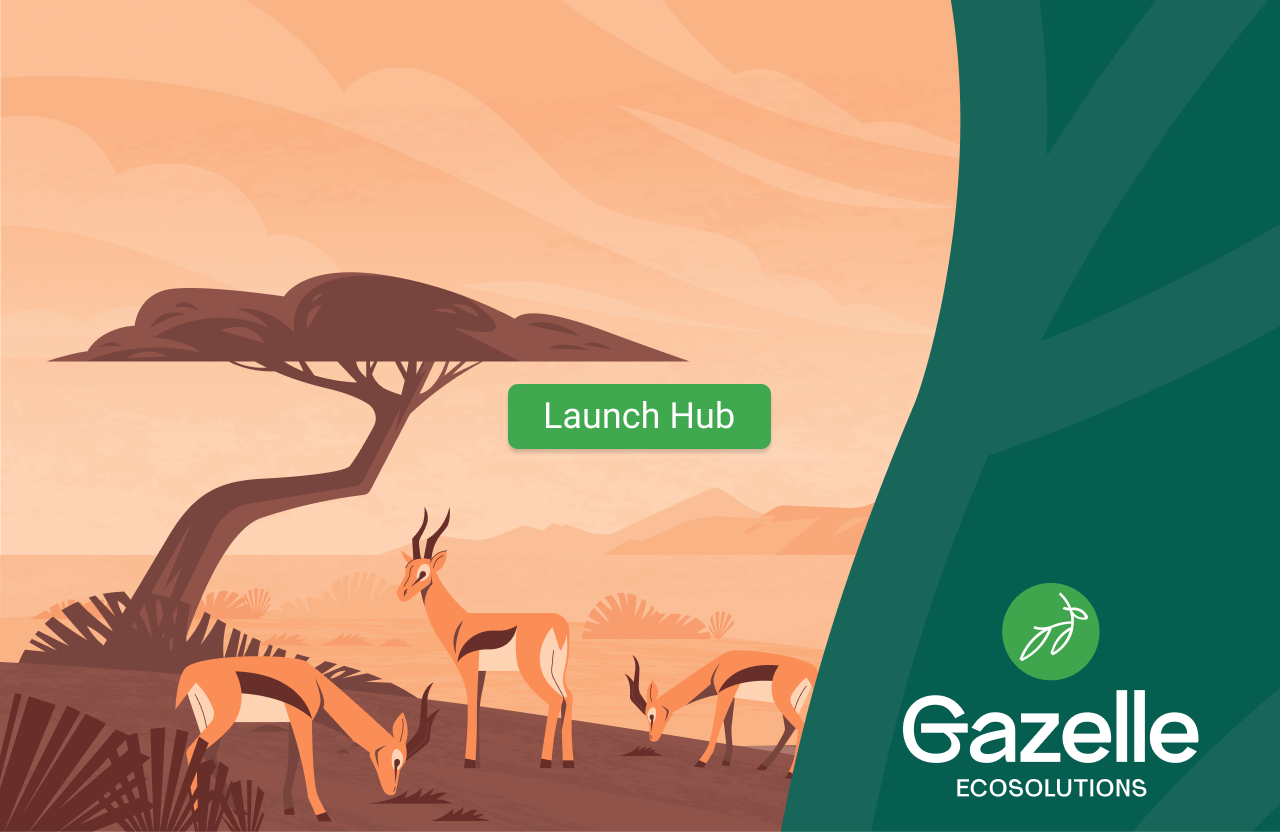
Illustrated Kalahari savanna with a single Launch Hub CTA — sets brand tone and context before any complexity is introduced.
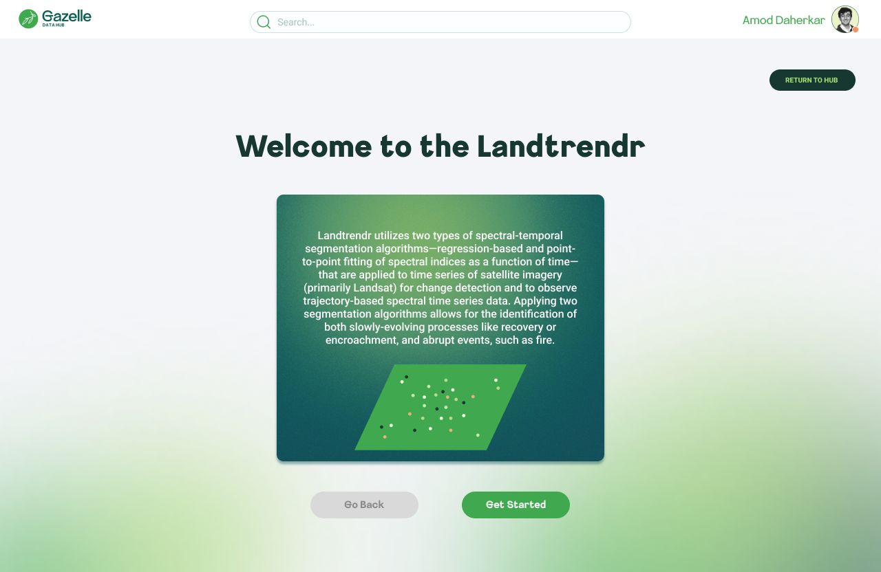
Each algorithm opens with a plain-language description before any parameters appear. Context before configuration — a pattern consistent across all three tools.
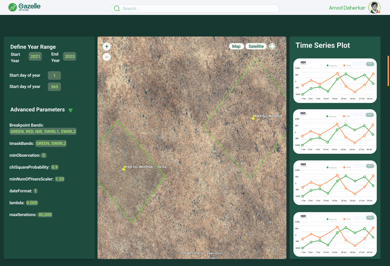
Parameters left, satellite map center, time series plots right. The spatial-first arrangement matches how scientists navigate data — see the geography first, then configure, then analyze output.
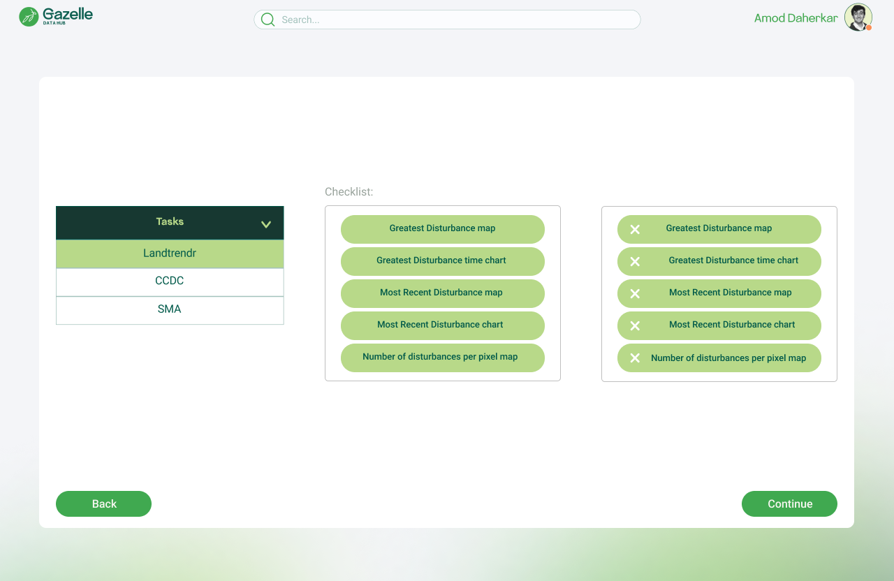
Dual-column layout (available vs. selected outputs) lets scientists curate exactly which maps and charts go into their MRV report. Category tabs prevent tool context-switching.
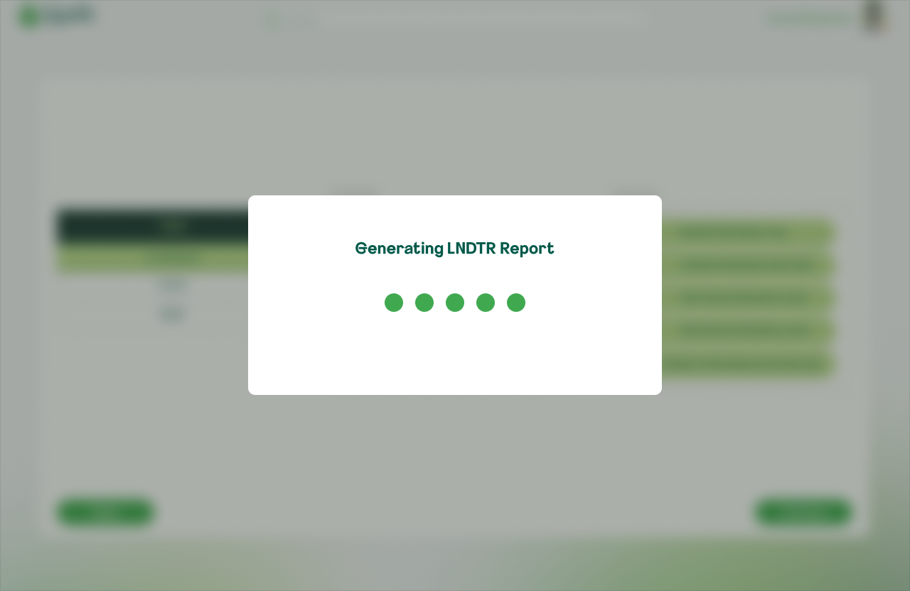
Named loading modals ("Generating SMA Report") give explicit feedback — replacing the prior ambiguity where users couldn't tell if a process had started.
Designed for ranch owners and land managers in Botswana — people who needed to register their land, input project data, and receive actionable recommendations without any scientific expertise required.
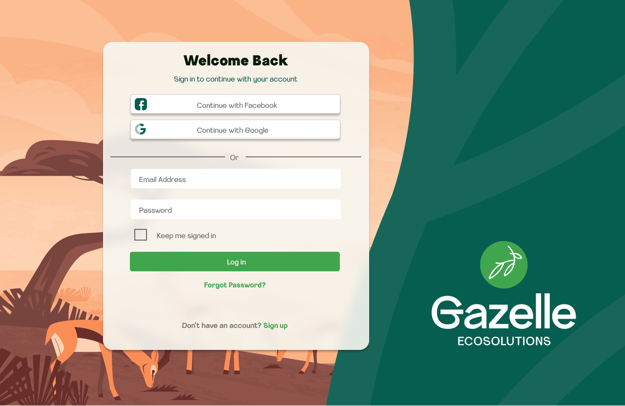
Social auth (Google, Facebook) alongside email/password, layered over the branded savanna illustration. Familiar login patterns reduce friction for non-technical users.
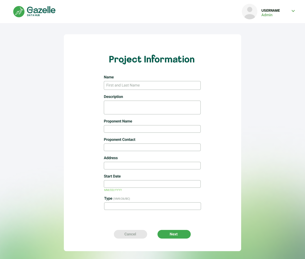
All details — name, contact, address, methodology type — confirmed in one screen before committing. Edit or Confirm prevents costly data errors downstream.
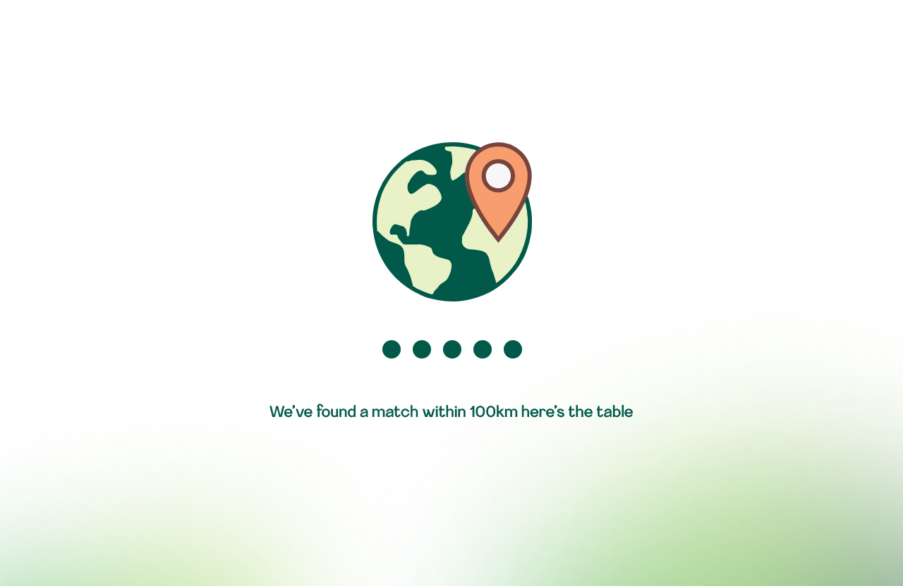
An illustrated loading state communicates that the system is searching for climate data within 100km of the ranch — reducing abandonment during longer processing times.
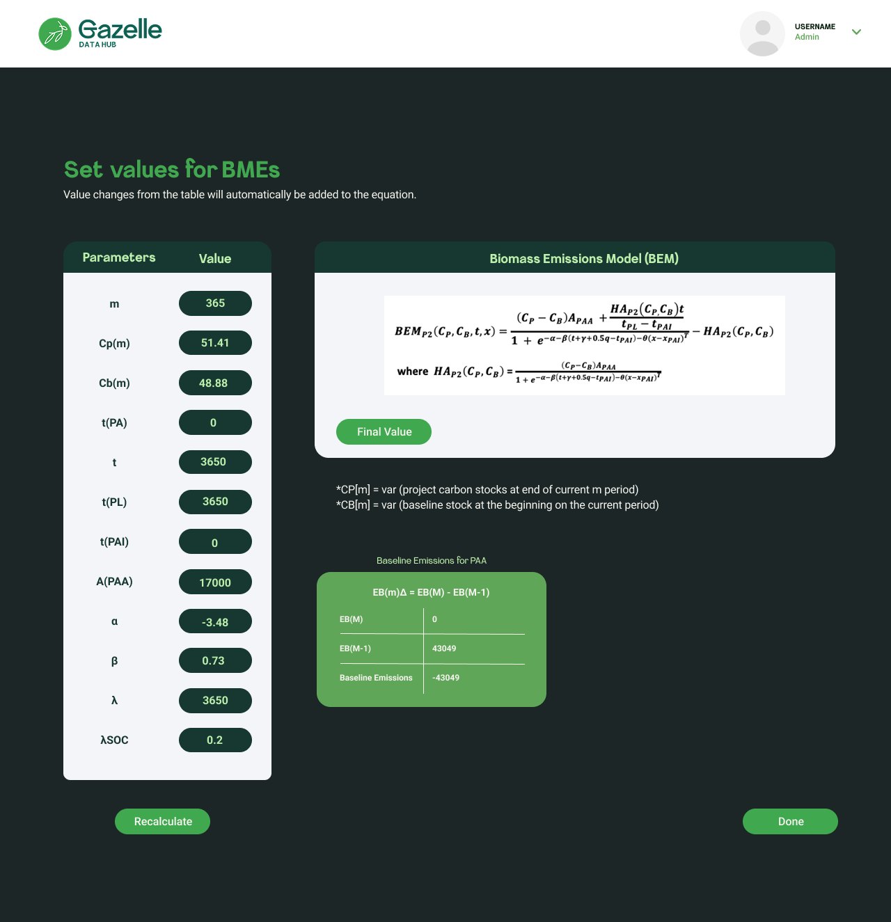
Live scientific equations update dynamically as users change parameter inputs. A complex scientific model made transparent and interactive for non-experts.
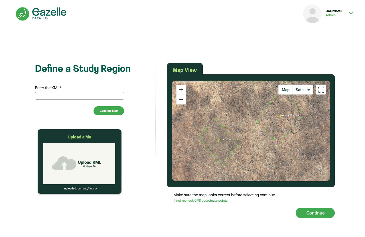
Allowing users to delineate specific areas of interest on the map, ensuring that climate data and analysis are relevant to their operational context.
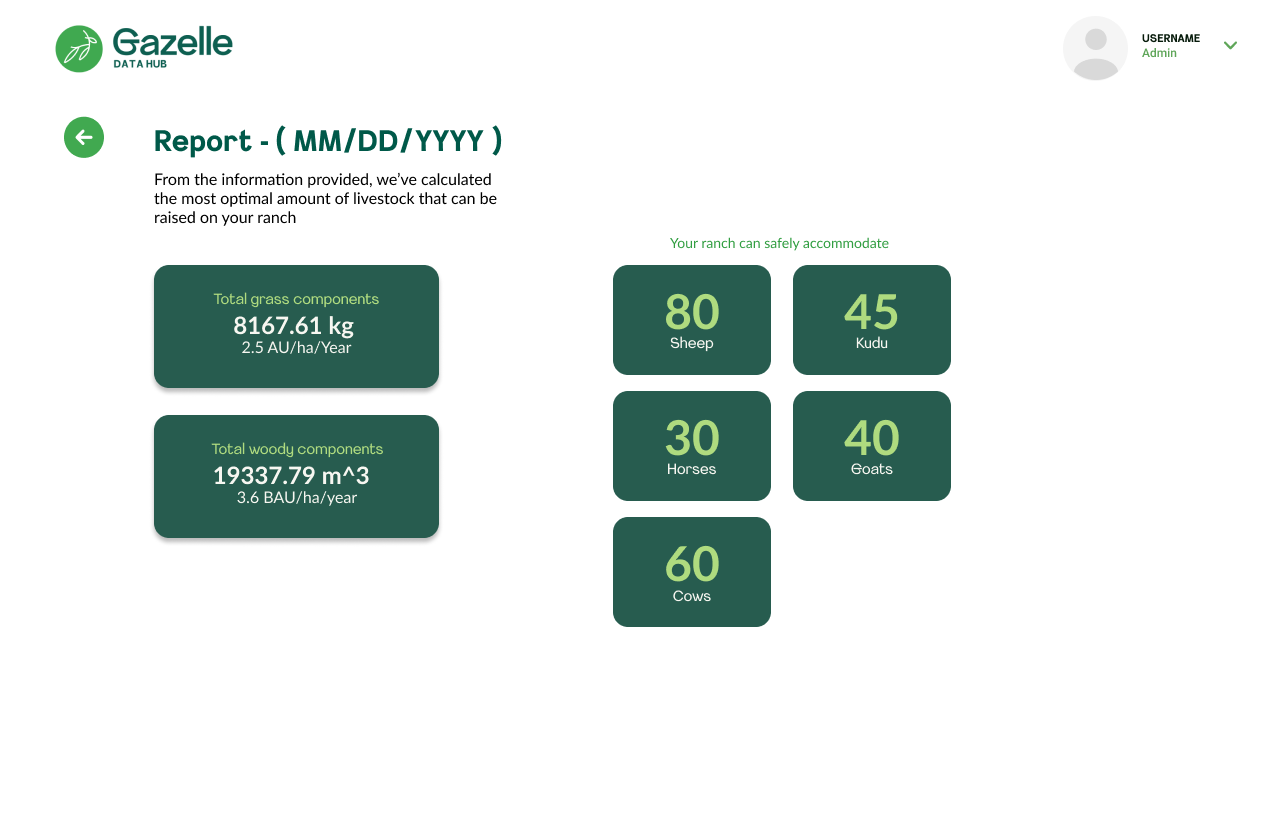
The final output shows exactly how many sheep, kudu, horses, goats, and cows the ranch can safely support — alongside biomass figures. Science translated into a clear, actionable result.
By restructuring the onboarding flow — starting with brand context, then tool introductions, then configuration — we reduced the time it took new clients to complete their first analysis run by 30%. Fewer support tickets, less hand-holding required from the Gazelle team.
The welcome screen pattern (context before configuration) became a reusable template applied consistently across all three algorithm tools — Landtrendr, CCDC, and SMA.
Working closely with the engineering team, I iterated on Gazelle's UI kit — standardizing components like cards, buttons, form inputs, loading states, and the three-panel analysis layout. This gave engineers a consistent set of patterns to build from, cutting design-to-code handoff time by 35%.
The Climate Action Reserve's U.S. Grassland Protocol platform — a separate but related product — benefited from the same component system, with 40+ wireframes delivered for that effort.
Designing for environmental scientists taught me something I hadn't fully internalized before: domain complexity doesn't go away — your job is to absorb it so the user doesn't have to. I spent the first few weeks just learning what NBR, CCDC, and spectral unmixing actually mean so I could translate them into interface patterns that made sense.
The three-panel layout came directly from watching how scientists move through their work — they think spatially first, then configure, then analyze the output. Matching the interface to that mental model wasn't a design insight, it was a research finding. That reinforced how much value comes from spending time with users before touching Figma.
Working with the engineering team on the UI kit also taught me how to be a better collaborator — learning to design components that were actually buildable, and iterating quickly when real constraints surfaced.